Case Study: Darmann
Brand Development
Darmann partnered with inConcert Web Solutions to develop a fresh brand identity reflecting the professionalism and innovative spirit that defines their reputation.
Reimagining the Logo

Original Logo
While once effective, Darmann's original logo showed signs of aging with a more traditional corporate feel. It did not fully capture the dynamic essence of their forward-thinking company.

Reimagined Logo
Darmann's new logo features a modern simplicity, showcasing bold typography coupled with an icon. The goal was to visually reflect their services in a refined, contemporary way.

Flexibile Design
Darmann thrives in various niche sectors and it was important that each division be able to tailor the logo for their audience when necessary. A new Market Logo format empowers them to adapt as needed while maintaining strong brand integrity.
Establishing Standards
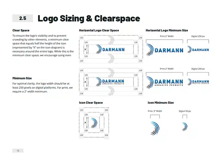
The success of a brand lies in the concerted effort to use it consistently and a key element to this is proper sizing.
A sizing guide gave the Darmann team an easy way to ensure their logo is properly sized across all channels.
Creating the Color Palette
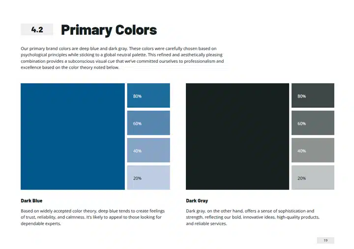
Colors wield a subconscious symbolism, so it’s important that they’re selected intentionally. Given their global service area, the choice of a neutral palette became not just a design decision but a commitment to cultural sensitivity.
While sticking to their roots, Darmann proudly retains blue as their primary color, now with a deeper hue that radiates professionalism. This is paired with a sophisticated dark grey.
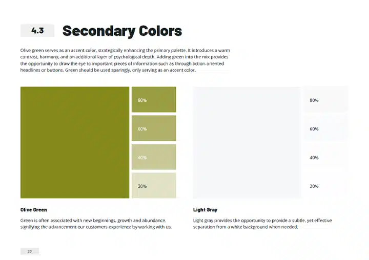
Introducing a secondary palette featuring olive green and light grey offers the perfect way to draw attention to essential information in their communications.
Choosing Impactful Fonts
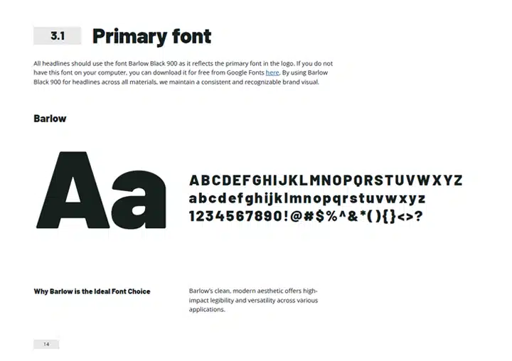
Since the Darmann logo would be showcased on a variety of materials such as manufactured products, print communications, and digital channels, it was essential that their logo used a clean, high-impact font. This allows for legibility at virtually any size. As their primary font, it is also used for headlines across all materials. To add versatility to their content, a secondary font provides an option for smaller body copy.
Shaping the Whole Brand Experience
Darmann’s comprehensive Branding Guidelines guides their team through every aspect of marketing and communication. From setting visual standards to providing copywriting guidelines, all the way to shaping customer service interactions, this powerful reference helps ensure they present a cohesive and united brand to the world.
Domain Search
Search for what is available now
and we can help with the rest!
Find Us
Main Office: 55 Lake Street – Suite 210
Gardner, Massachusetts 01440
978-632-5300
inConcert Web Solutions, Inc. | Privacy Notice | Terms of Use | PCI Compliance | Site Map | Contact Us

