manufacturing, BRanding
Key Facts
About This Branding Plan

Original Logo
While once effective, Darmann’s original logo showed signs of aging with a more traditional corporate feel. It did not fully capture the dynamic essence of their forward-thinking company.

Reimagined Logo

Flexible Design
Establishing Logo Size and Consistency Standards

branding guidelines
Darmann Abrasive Products
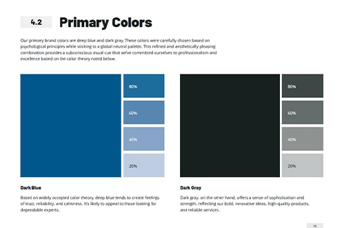
Creating the Color Palette
Colors wield a subconscious symbolism, so it’s important that they’re selected intentionally. Given their global service area, the choice of a neutral palette became not just a design decision but a commitment to cultural sensitivity.
While sticking to their roots, Darmann proudly retains blue as their primary color, now with a deeper hue that radiates professionalism. This is paired with a sophisticated dark grey.
Introducing a secondary palette featuring olive green and light grey offers the perfect way to draw attention to essential information in their communications.
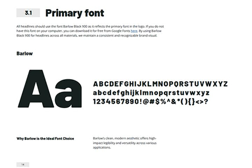

Typography