manufacturing, BRanding
Key Facts
About This Branding Plan
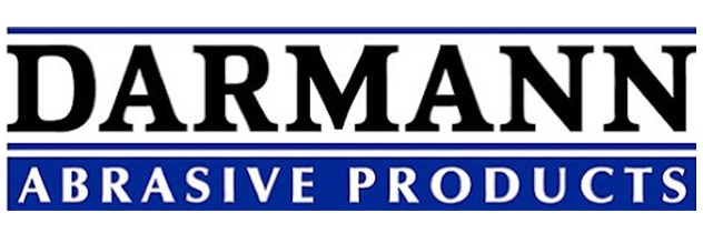
Original Logo
While once effective, Darmann’s original logo showed signs of aging with a more traditional corporate feel. It did not fully capture the dynamic essence of their forward-thinking company.
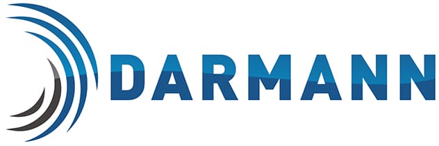
Reimagined Logo
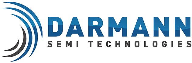
Flexibile Design
Establishing Logo Size and Consistency Standards

branding guidelines
Darmann Abrasive Products
Creating the Color Palette
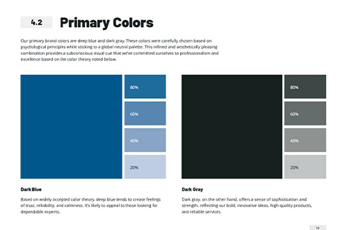
While sticking to their roots, Darmann proudly retains blue as their primary color, now with a deeper hue that radiates professionalism. This is paired with a sophisticated dark grey.
Introducing a secondary palette featuring olive green and light grey offers the perfect way to draw attention to essential information in their communications.

Creating the Color Palette
While sticking to their roots, Darmann proudly retains blue as their primary color, now with a deeper hue that radiates professionalism. This is paired with a sophisticated dark grey.
Introducing a secondary palette featuring olive green and light grey offers the perfect way to draw attention to essential information in their communications.
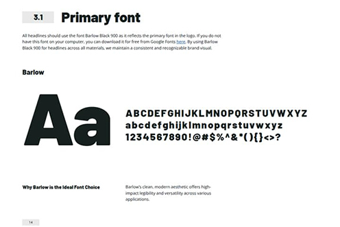

Typography